01 · Introduction
Simple, clear
banking.
NOVA is a bilingual digital bank for the Gulf. Ten mobile screens, a component library, and one rule holding them together: every number on screen can be asked about, and answered.
Why is my balance lower than I thought? Why did my transfer fail? Why did I spend more this month? Customers usually call the bank to ask. NOVA answers these in the app.
02 · Problem & approach
Customers could see their balance, but not understand it
Regional banking apps are competent at display and poor at explanation. They show a balance, a list of transactions, and a fee, then leave the customer to work out whether this month was normal, why a transfer failed, or how much of the balance is actually theirs to spend.
That gap has a cost, and it lands in the call centre. The real problem wasn't making the dashboard prettier. It was working out what the app should tell the customer when a number doesn't add up.
Our goal: any figure the app shows, the app can explain, in the customer's own language, without a phone call.
The balance overstated what was spendable
Committed rent, standing orders and a pending card hold all sit inside the headline figure, so the number people budget against is wrong.
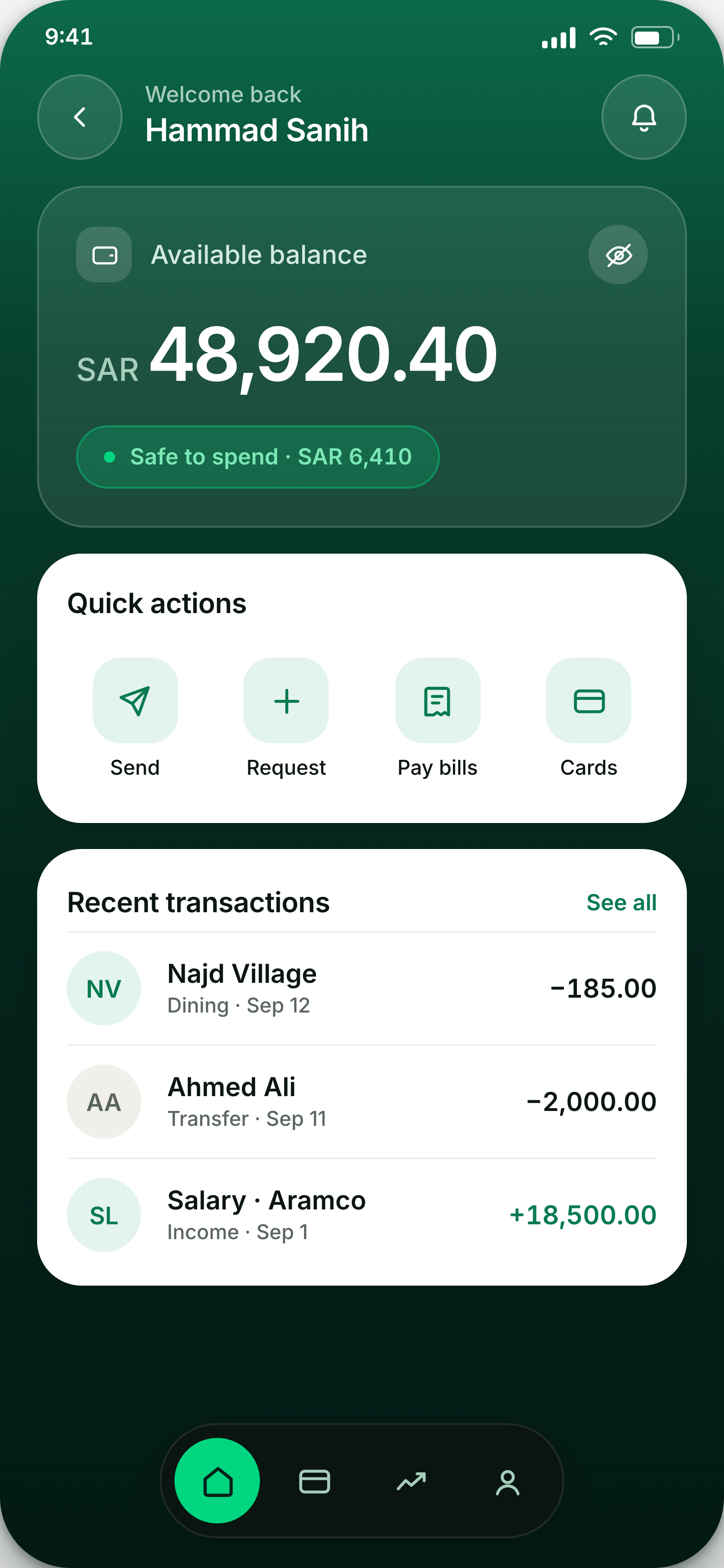
Solution · A safe-to-spend figure directly under the balance, derived from commitments, with the deduction visible rather than assumed.
An assistant nobody would trust with money
A chat bubble that asserts a spending figure is worse than no answer. The customer can't check it, so they call anyway.
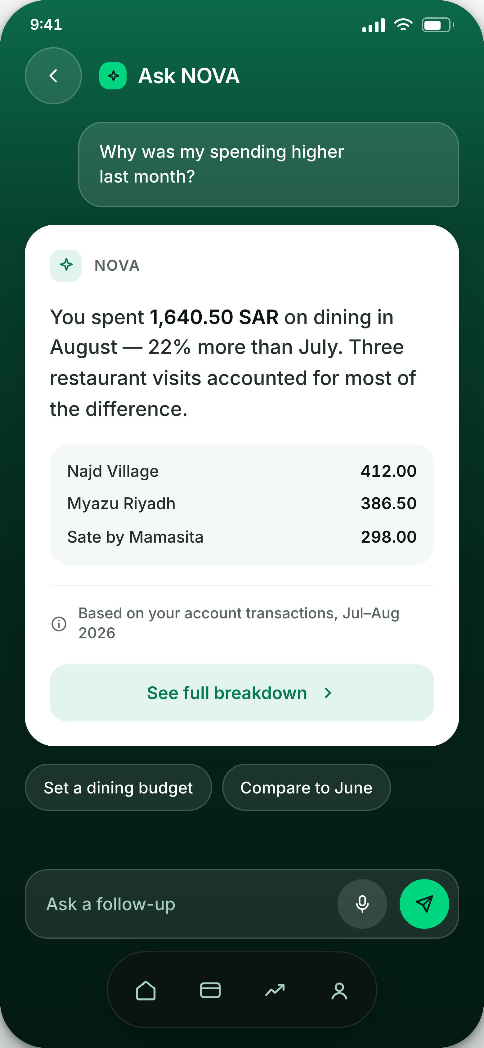
Solution · Every assistant answer is a card: the claim, the transactions it was computed from, and a dated transparency label naming the source range.
Failures were dead ends
A declined transfer returned a code and a closed door. The customer did not know whether to retry, wait, or escalate.
Solution · A dedicated recovery screen that states the cause in plain language and offers the two moves that actually resolve it.
Arabic was a translation, not a layout
Bilingual products in the Gulf typically ship an English layout with Arabic text poured in, which breaks numerals, alignment and reading order.
Solution · RTL is a first-class state in the component library, and tested on the most important screen, transfer review.
03 · Project map
App structure
Sign-in is one step. Every tab leads back to the money overview, and the assistant can be opened from any screen.
04 · Foundations
↗ Open the design systemColour and type
The interface uses one deep green gradient. Bright green is kept for things you can tap, which keeps the app calm and makes actions easy to spot.
05 · Mockups
10 screensScreens
Grouped in four parts: entry and overview, then the assistant, then moving money, then the screens that protect it.
Entry and overview
00 – 02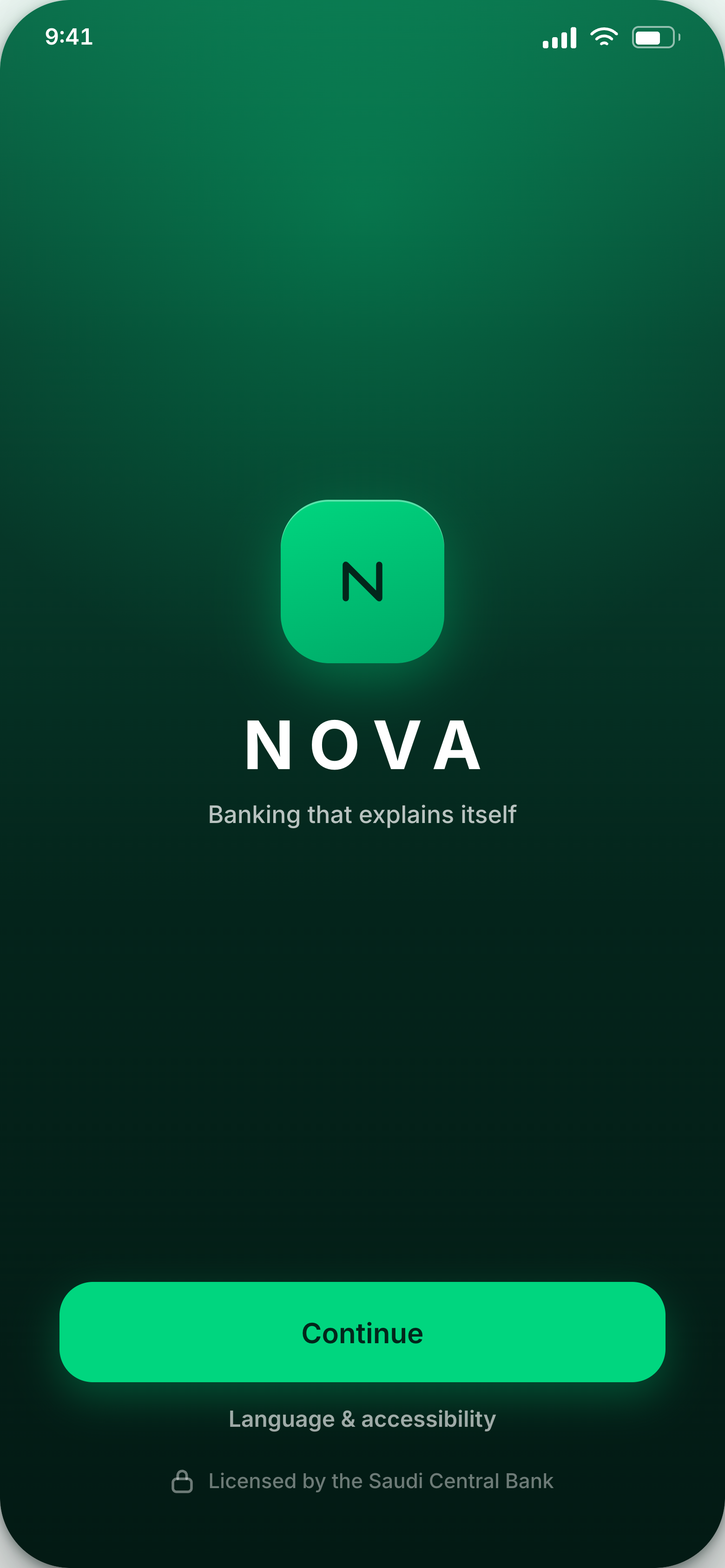
The session is secured while the brand loads, so the loading time does real work. Accessibility settings are reachable before sign-in, not buried after it.
Balance, then safe-to-spend directly beneath it as a stated figure. Four quick actions and recent activity follow.
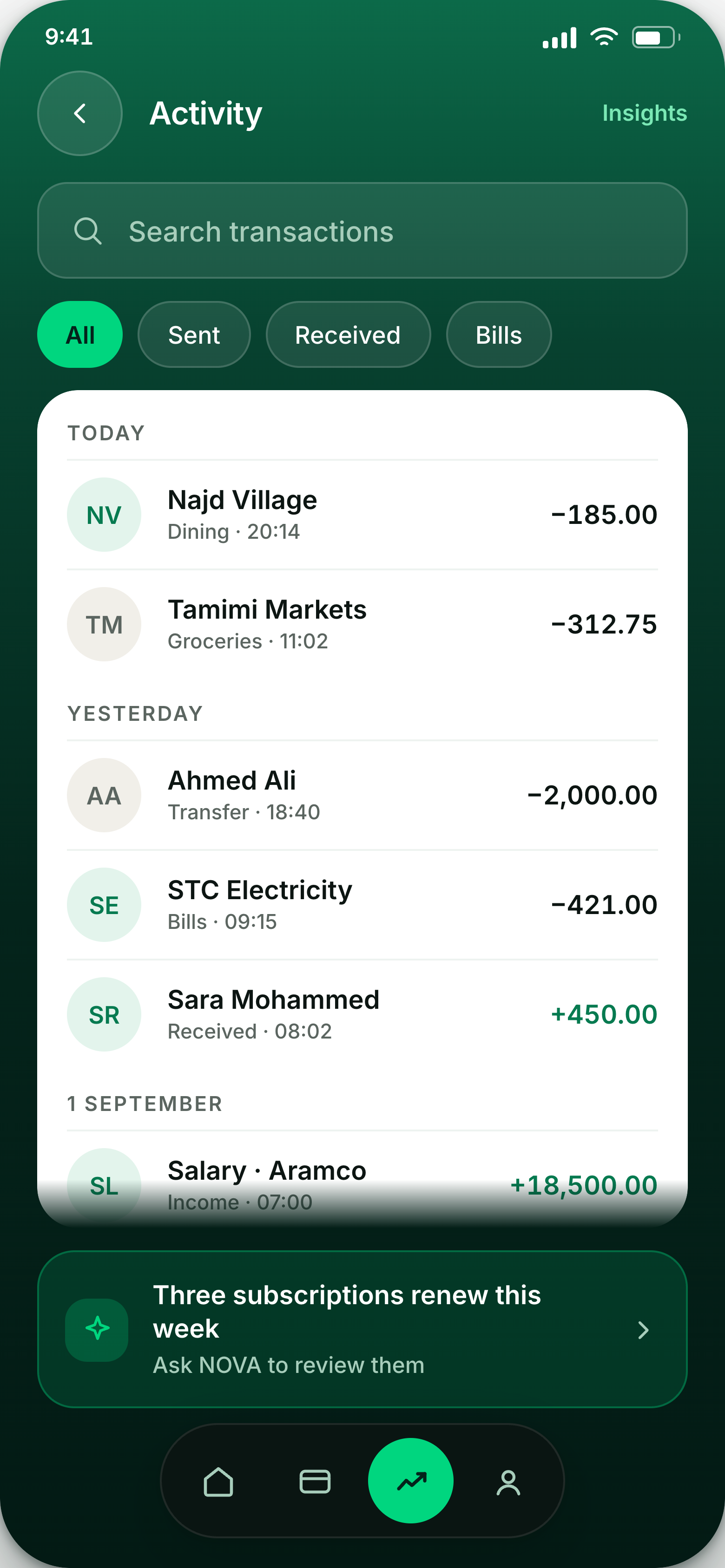
Search and filters first, because history is only useful when it can be narrowed. An assistant card sits inline, offering to explain the pattern the list is showing.
The assistant, and what it owes you
03 – 04Answers appear as cards: the figure, the three merchants that produced it, and the date range it was drawn from. Follow-ups are offered as chips so the next question is one tap.
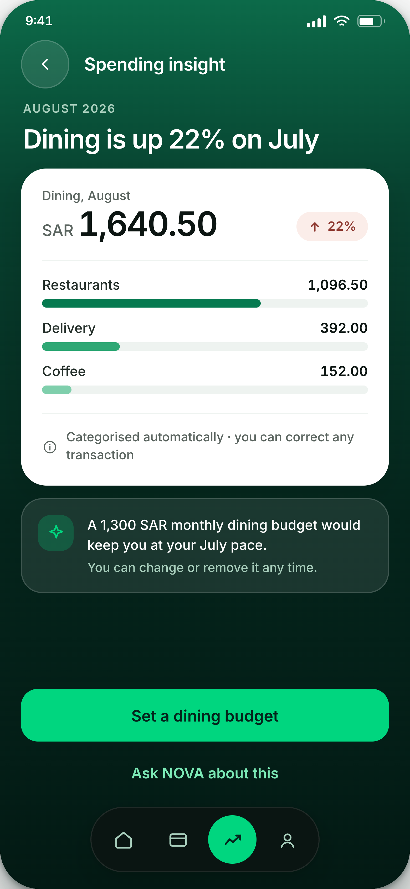
A month-over-month change, explained by category rather than charted for its own sake. The transparency label names the source data, so customers can check the conclusion for themselves.
Moving money
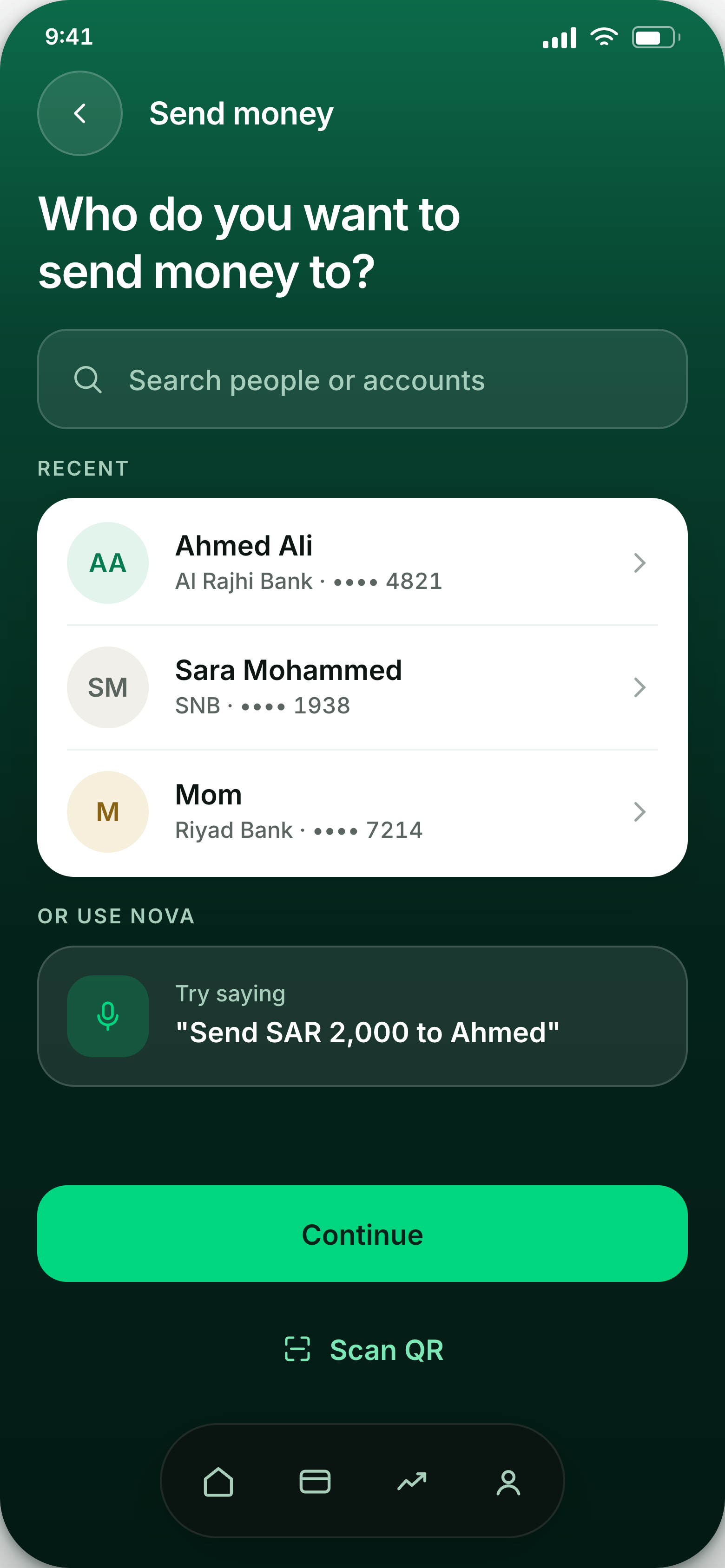
05 – 07Recents lead, search is there when they don't. The voice suggestion is phrased as a real sentence so the customer learns what the assistant will accept.
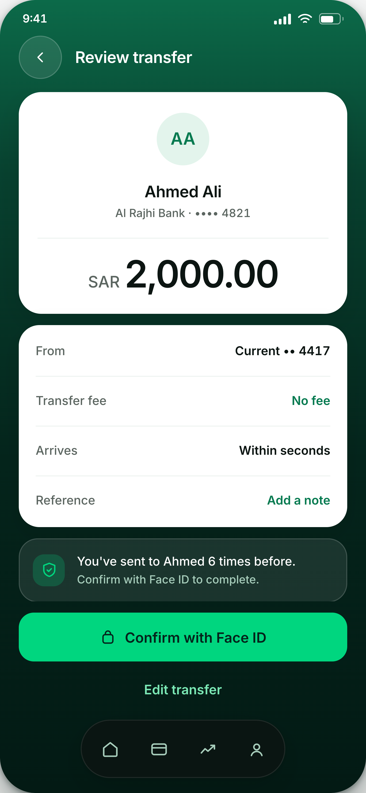
Before sending, the customer sees six things: who, how much, where, the fee, when it arrives, and how it is secured. The fee is stated here rather than discovered on the statement.
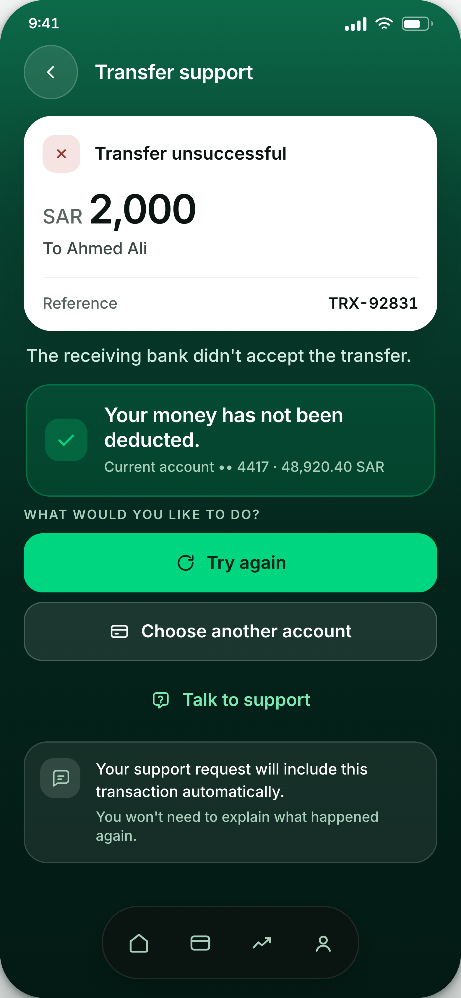
Failed transfers get a full screen instead of a brief error message. The cause is named, the money is accounted for, and the next action is offered before the customer thinks to call.
Protecting it
08 – 09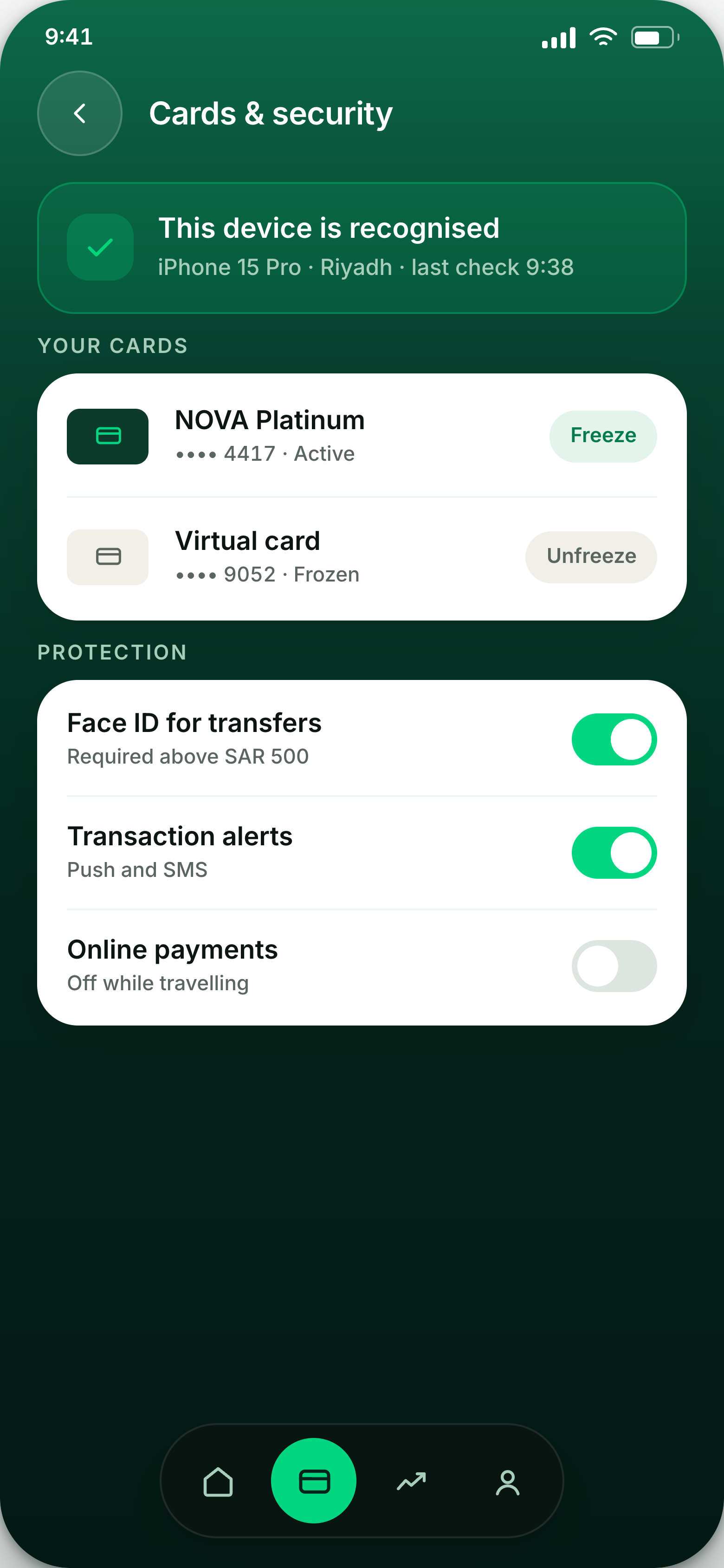
Freeze is the first control, because it is the one people reach for in a hurry. Device checks and protection toggles sit below, each described by what it does.
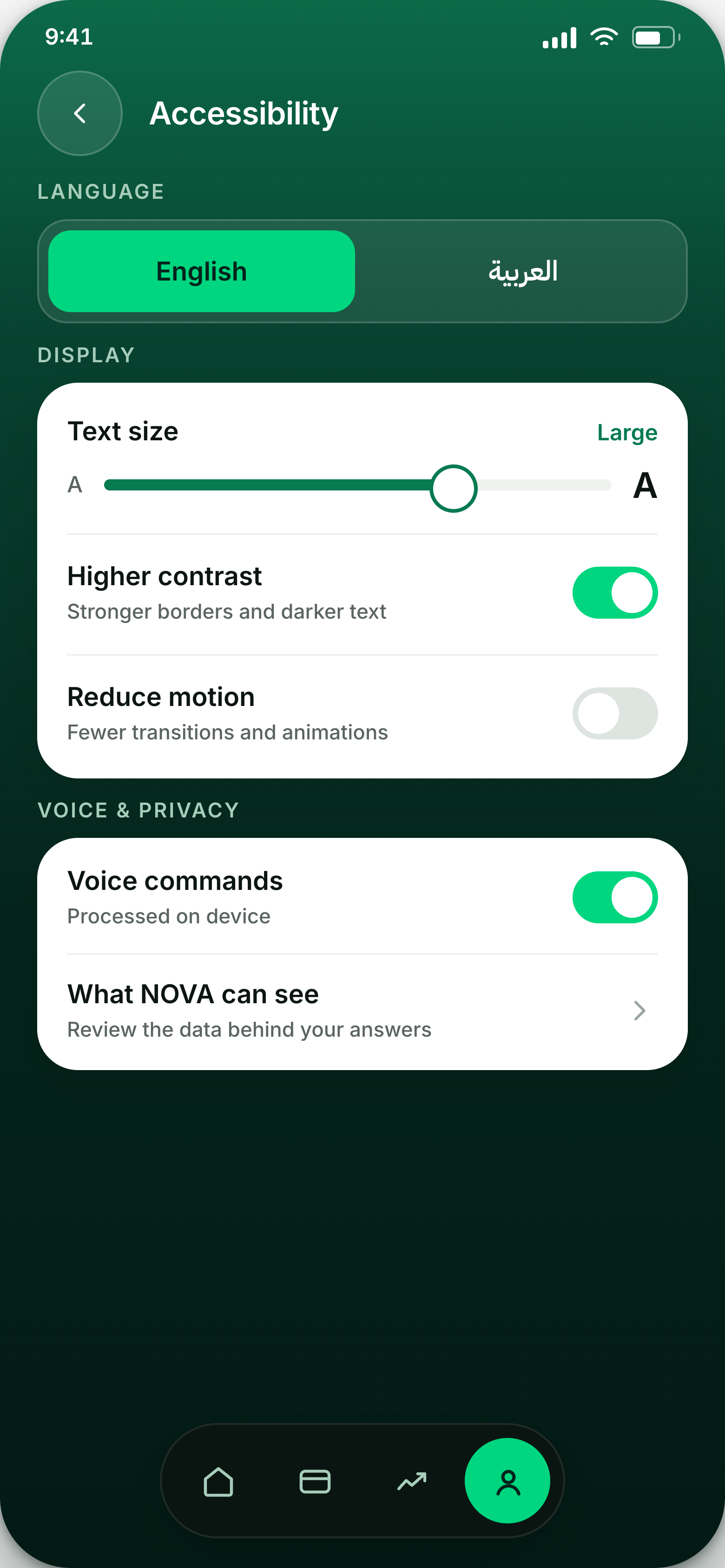
Language, display, voice and privacy in one place. Switching to Arabic changes layout direction and numeral rendering, not just the text. That's why RTL support was built into the components from the start.