01 — Introduction
Resupply, on
schedule.
Syncpatient connects CPAP and PAP patients directly to their medical supply providers: masks, tubing and filters ordered on the three-month cycle, then tracked to the door.
Patients enrol once and verify their prescription; the app then tracks eligibility for them. When supplies come due, a clinical reorder collapses into two taps.
02 — Problem & approach
Reordering supplies felt like filing paperwork
CPAP therapy only works if the consumables stay fresh: masks every three months, cushions monthly, filters every two weeks. Yet the reorder itself sat behind a phone queue, a fax-era portal, or an email chain with a supplier rep.
We interviewed patients and supply coordinators. The same three failures came up every time: eligibility was invisible, order status disappeared after checkout, and the language never matched the way people actually talk about the machine sitting beside their bed.
So the product goal narrowed to one sentence — a patient should be able to reorder everything they're due for, in under thirty seconds, without asking anyone a question.
Eligibility was invisible
Nobody knew which items were covered this cycle, so patients over-ordered or waited past due.
Solution — Surface a per-item eligibility state on the home screen, with item-level dates in one view, so nothing has to be looked up.
Orders went dark after checkout
Once an order was placed there was no confirmation of the state it was in, and no way to check.
Solution — One shared timeline for placed, approved, shipped and delivered, repeated on home, in tracking, and in order history.
Onboarding asked too much, too early
An earlier build asked insurance, prescription and shipping details in one wall of fields before showing anything useful.
Solution — Split enrolment into six steps with OTP verification, each one a single decision, and defer everything that can wait.
Clinical language, patient audience
HCPCS codes and coverage windows meant nothing to someone replacing a nose cushion.
Solution — Plain-language item names with the billing code kept as secondary metadata for support calls.
03 — Project map
Mapping the whole journey
Entry is linear until a verified account hits home. Everything after that hangs off five branches, with account management nested one level deeper.
04 — Mockups
19 screensThe shipped interface
In three orders: entry and enrolment, then reordering and tracking, then account and history.
Entry and enrolment
01 – 08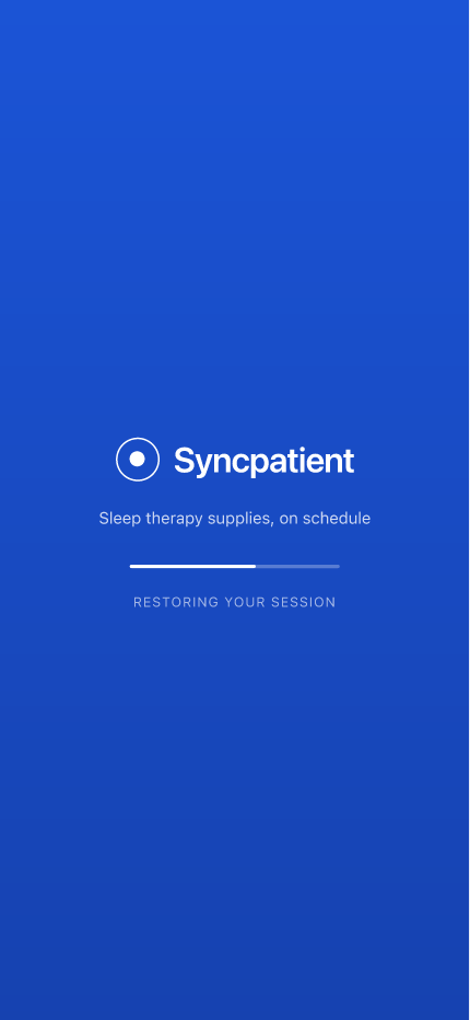
The session restores in the background, so a returning patient lands on home. A first-run falls through to sign in.
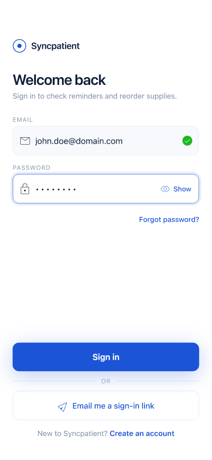
Email and password, with a magic-link fallback. Field validation resolves inline, before the patient is mid-password.
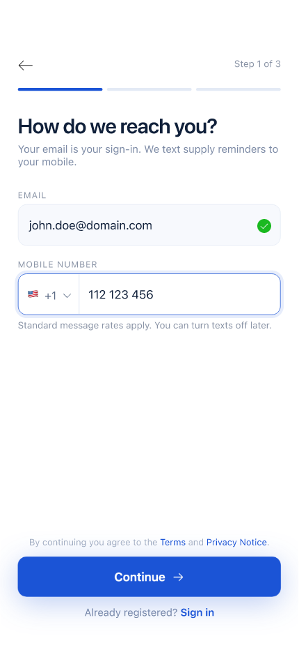
Step one of three. Email becomes the sign-in; the number carries supply reminders. Both explain why they're asked.

Six digits, verified automatically on the last character. The resend timer is visible instead of hidden behind a retry.
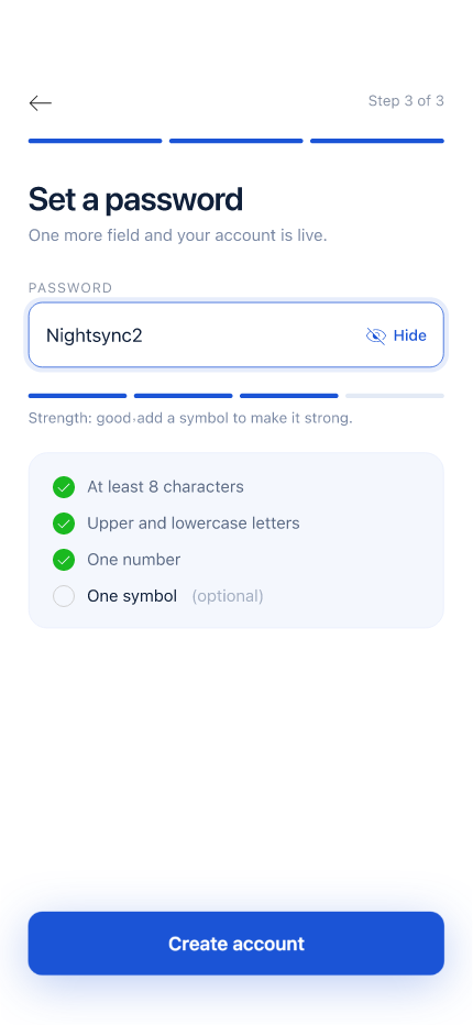
Requirements resolve as they're typed rather than after a failed submit. The symbol rule is the one most people miss.
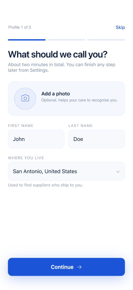
Preferred name is what the app greets you with, and what the record shows support. Legal name is collected separately.
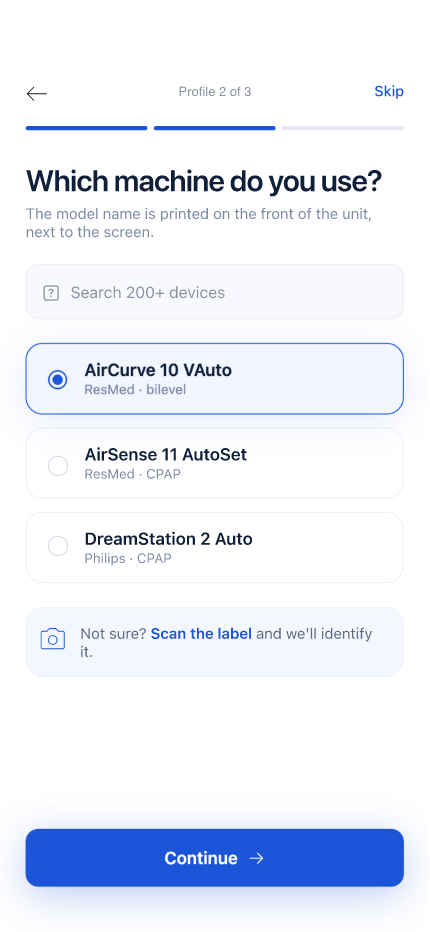
Device drives the compatible consumables list. If the model isn't listed, a photo of the label routes to a coordinator.
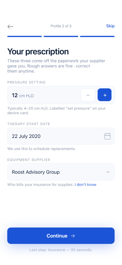
The last step, and the one that sets the replacement clock. Mask size, pressure and supplier all resolve from here.
Reordering and tracking
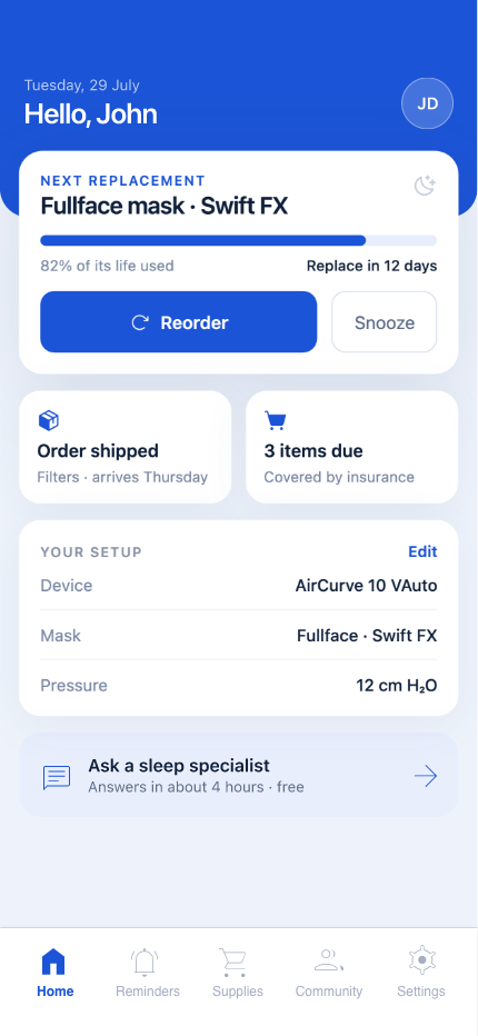
09 – 16One card answers what is due next, with reorder one tap away. Setup and shipping status sit directly beneath it.
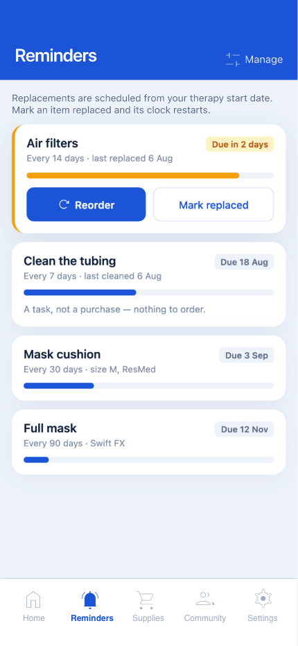
Every consumable and its own schedule, sorted by urgency. Cleaning tasks are marked replaced rather than ordered.
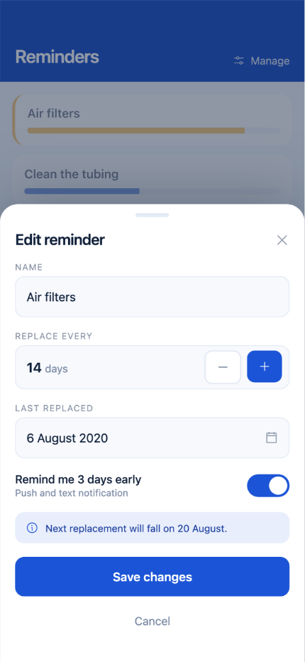
A sheet, not a screen. Interval and notification time are editable per item; the schedule recalculates on save.
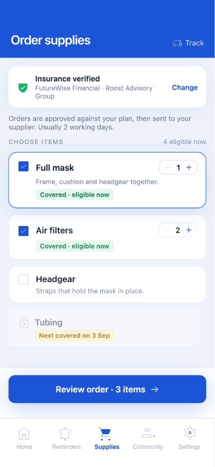
Coverage is stated before the cart rather than at checkout. Ineligible items stay visible, with the date they unlock.
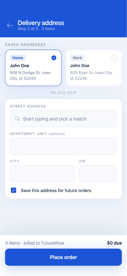
Saved addresses lead, a new one is optional. The last confirmed address is preselected so shipping is a single tap.
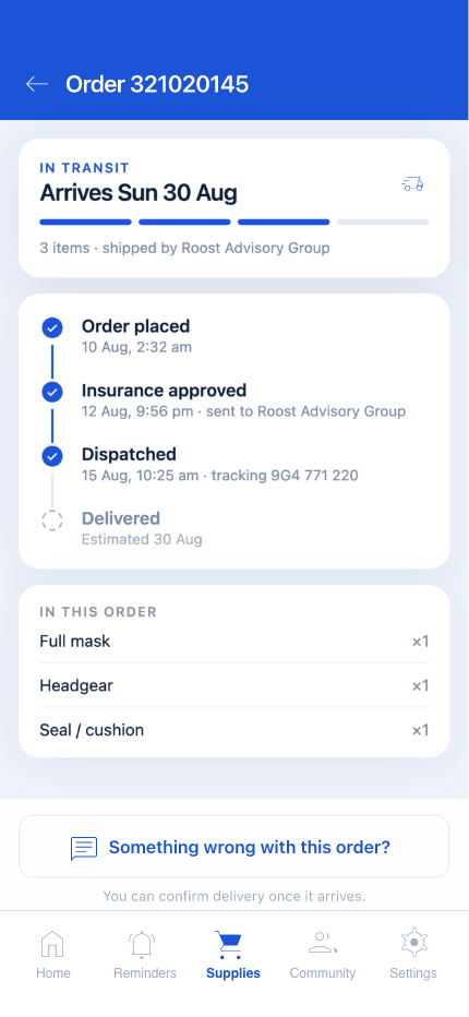
Four stages with the timestamp each one cleared. The delivery estimate carries a visible confidence, not a promise.
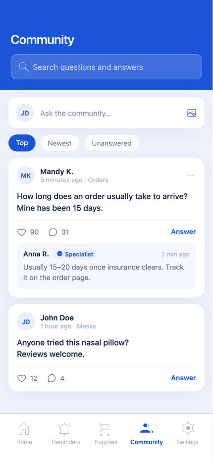
Mask-fit questions, sorted by activity, with staff replies badged. Topics are pre-scoped so posts stay searchable.
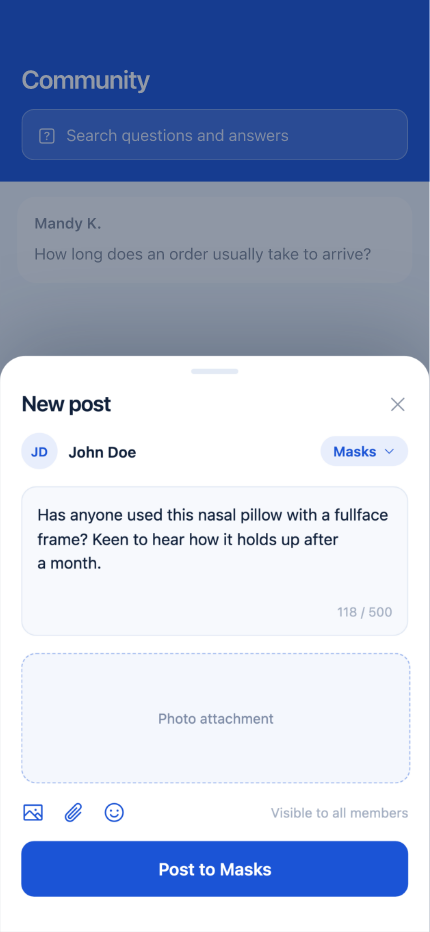
Posting is a sheet, not a screen, so context is never lost. Topic is preselected from wherever the patient started.
Account and history
17 – 19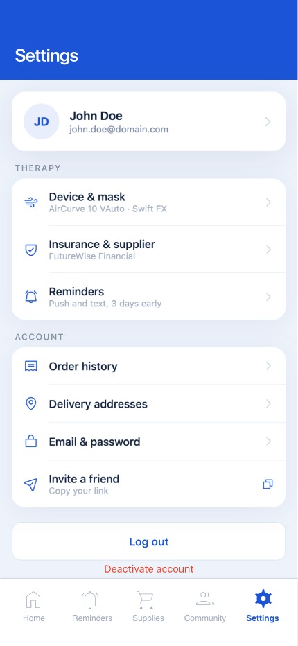
Therapy, account and preferences, grouped so the destructive actions sit apart from anything used weekly.
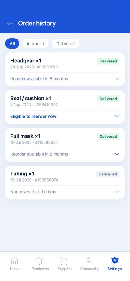
Filtered by status, with the same status vocabulary used everywhere else. Reorder repeats a past order in one tap.
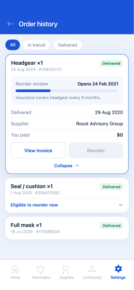
Items, the insurance split and the delivery record in one page — the screen support asks a patient to read out.