01 · UX case study · concept
Brand Guidelines Checker.
Upload a design or a URL, get an instant brand-compliance report showing what's on brand, what's not, and exactly where.
02 · The problem
Brand guidelines live in a PDF nobody opens
Every new landing page, deck or campaign asset drifts a little further from the approved palette, the right weight of a headline, the correct clear space around a logo. By the time a reviewer catches it, the work has already shipped.
Review cycles turn into a slow, manual diff between what the deck says and what's actually in the file, and the same violations get caught over and over, late, by hand.
The opportunity was to make brand compliance instant and specific. Instead of a checklist designers have to remember, the tool reads a real file or live URL and shows exactly what's off and where.
Designer
Wants to catch drift before handing a file off for review, not after.
Brand manager
Needs one source of truth for the rules, and proof they're being followed.
Marketing / agency
Ships fast across many assets and needs a quick, objective sanity check.
03 · The core flow
How a check works
Input
Upload a file or paste a URL.
Select profile
Choose which brand's rules apply.
Analysis
Every rule category is audited.
Report
A scored, annotated result.
Action
Fix violations, re-check, ship.
What gets checked
Four rule categories, echoed everywhere from the report to the rule editor.
Color
Exact hex match against the approved palette, no tolerance.
Typography
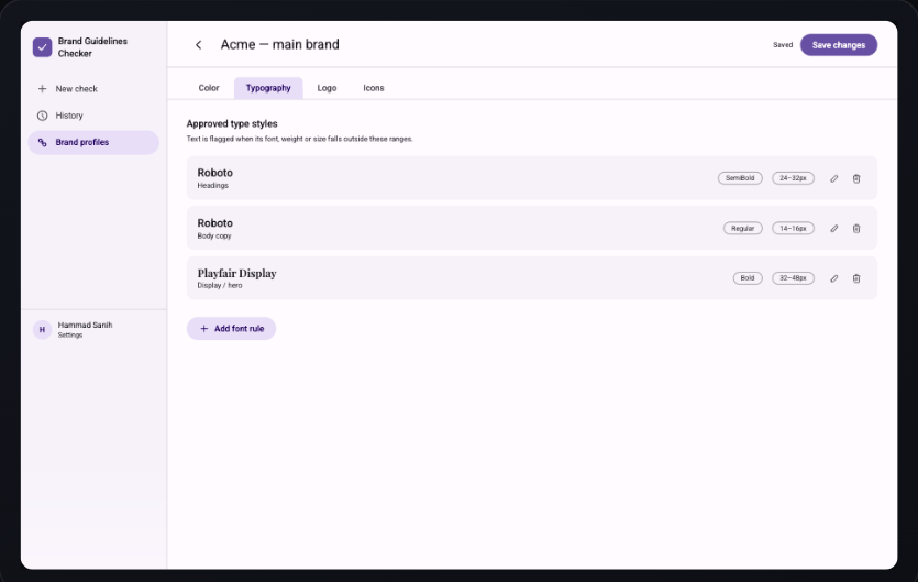
Font family, weight and size range per usage.
Logo usage
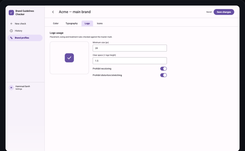
Minimum size, clear space, no recoloring or distortion.
Iconography
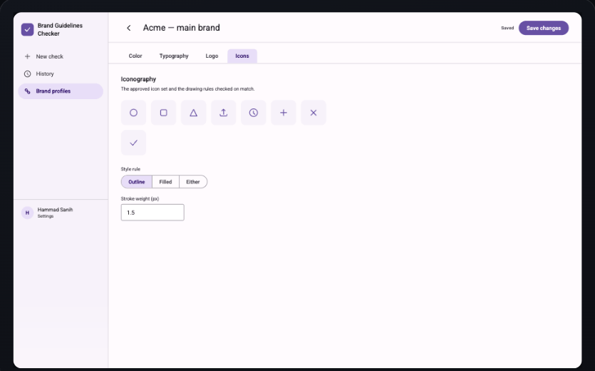
Approved icon set, style and stroke weight.
04 · User journey maps
User journeys
How the designer and the brand admin each move through the product.
UX Designer
Finishes a landing page and needs a fast sanity check before handoff.
Slightly anxious, with no time for a manual review.
Drops the Figma export into New Check.
Relieved: no setup, no waiting on a reviewer.
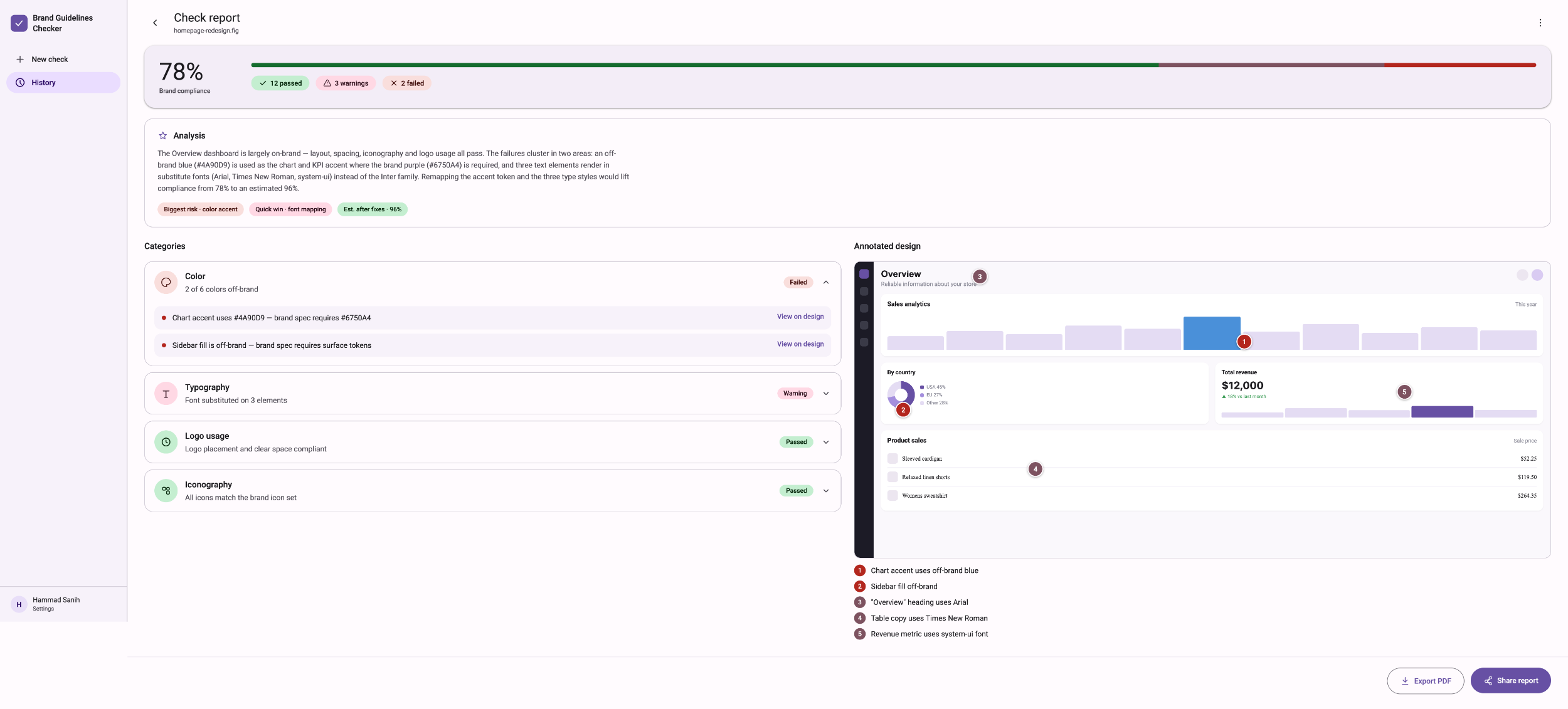
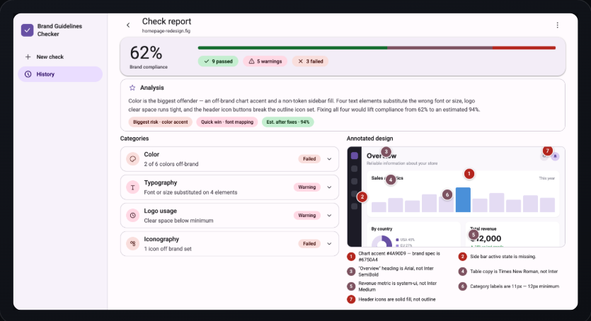
Scans the score, opens the two failed categories.
Focused, because the pins say exactly where to look.
Jumps back into the file and corrects the flagged color and font.
In control, with a concrete fix list instead of vague feedback.
Runs the check again and sees the score climb to 96%.
Confident shipping without waiting on brand sign-off.
Brand / Admin
Notices a partner deck used the wrong logo lockup last quarter.
Frustrated that the guidelines PDF clearly isn't being read.
Opens the Rule Set Editor and tightens the logo clear-space rule.
Methodical, finally editing the real spec and not a slide.
Saves the profile under Acme, main brand.
Satisfied: one source of truth for every team to check against.
Checks History to see which recent submissions failed logo rules.
Assured, with visibility and no chasing people down.
Duplicates the profile into a draft for a new sub-brand.
Efficient, reusing 80% of an existing rule set.
05 · Walking through the screens
5 screensFrom first upload to an editable brand spec
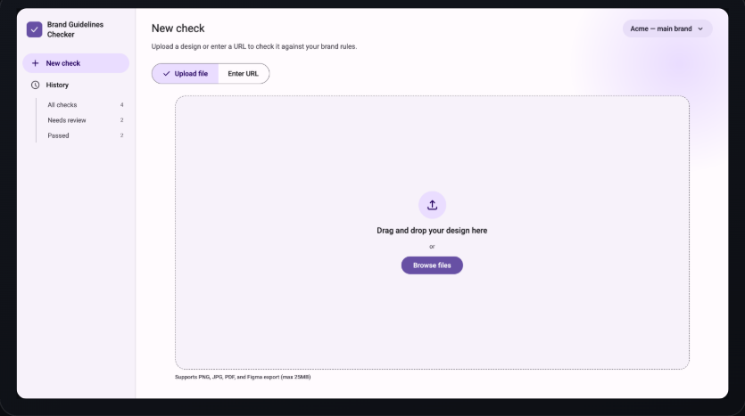
Starting from almost nothing
The entry point had to work for a dragged file or a pasted URL with zero friction. A single large dropzone with a segmented control above it keeps both paths equally prominent, and an animated background gives the empty state some life without competing with the task.
Showing the work
This is the screen that has to prove the tool actually looked at the file. A compliance score and expandable category list sit beside the real mockup with numbered pins landing directly on the off-brand elements, so every issue is shown exactly where it is.
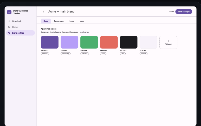
Turning a PDF into a real spec
Behind every check is a rule set someone has to define. The editor mirrors the report's four categories exactly (color, type, logo, icons), so an admin edits the same mental model a reviewer later reads. The layout is dense and functional.
One tool, many brands
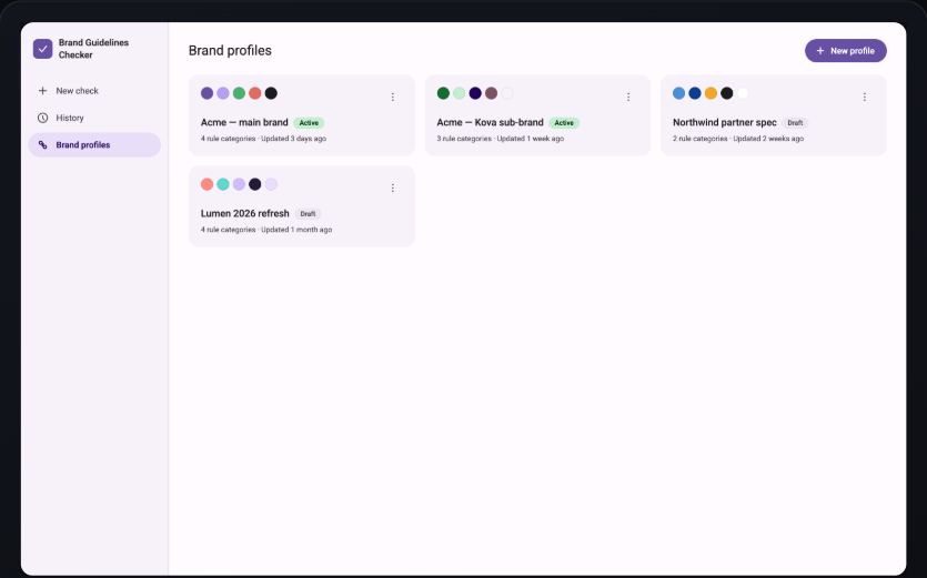
Agencies and multi-brand teams needed more than one rule set. A simple card grid of palette strip, status and last edited makes switching between an active brand and a draft sub-brand a quick decision.
Telling the story outside the product
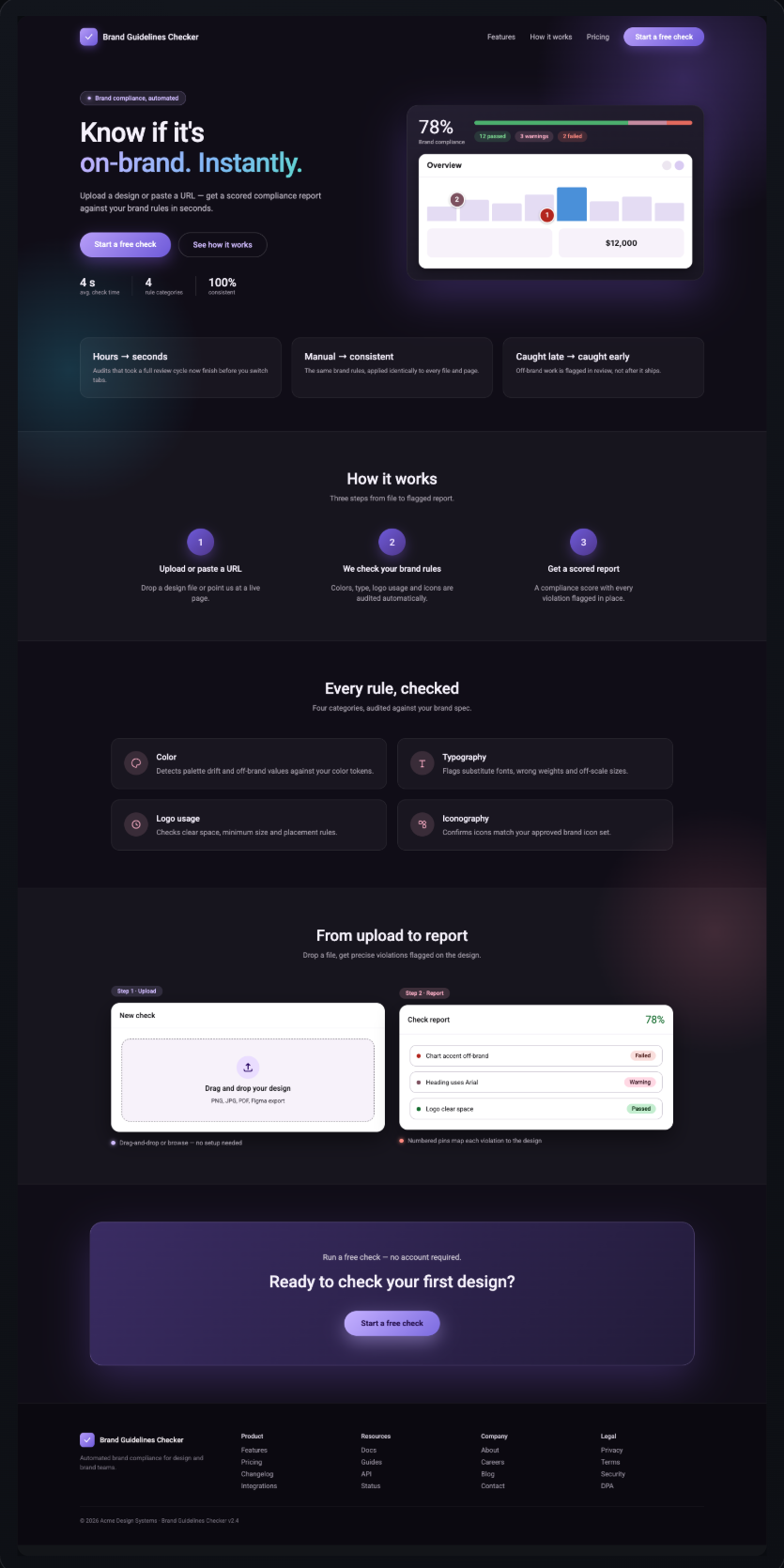
The marketing page borrows the product's own report card as its hero image, because the fastest way to explain what the tool does is to show it working, against a dark canvas the in-app UI deliberately doesn't use.
06 · Decisions & outcomes
Structured rule sets
Brand rules moved from a static PDF into an editable, versioned spec four categories deep.
Exact hex matching
No fuzzy tolerance. Color checks are pass/fail against the literal approved value.
Static URL export
Any live page can be checked with no crawler setup, just a pasted link.
Five screens, one system
New Check, Report, Rule Editor, Profiles and Landing all shipped on a shared token set.